
The Project
Critical Items was a feature created for GE Aviation to help customers monitor the repair reports for their engines. During my time at GE Aviation, I was lead designer for this feature working with a development team based in India. This project allowed me to experience a UX process in a corporate business setting which I have outlined below.
Some information is confidential, images have censored where necessary but feel free to ask me about anything! This project was completed during January 2020 to May 2020 as part of my co-op rotation.
The Ideal State

The feature functions for both internal and external customers to manage their engine health.
Needs to be compatible with the current product to ease the transition of internal users and needs to build off of the functionality to create a better user interface for external users.
The feature complies with the current component standards while also creating more efficient rules for future products to comply with.
As the most current product for this portal, it must express the complexity and functionality of the rest of the portal's products.
The Process

Taking over the project: I took over the design work for this product from a non-designer who became my researcher on the project. This was helpful because I was able to directly ask about previous design decisions made and make more educated improvements.
Learning Sketch: I used Sketch to develop the designs which was a product I did not have experience with. To learn the software I took the originally designed screens and improved them for practice.
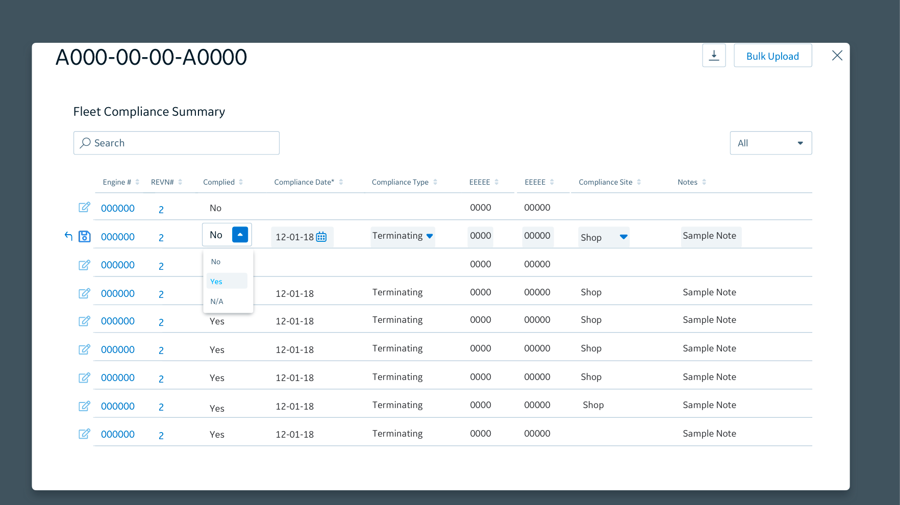
Example of original design
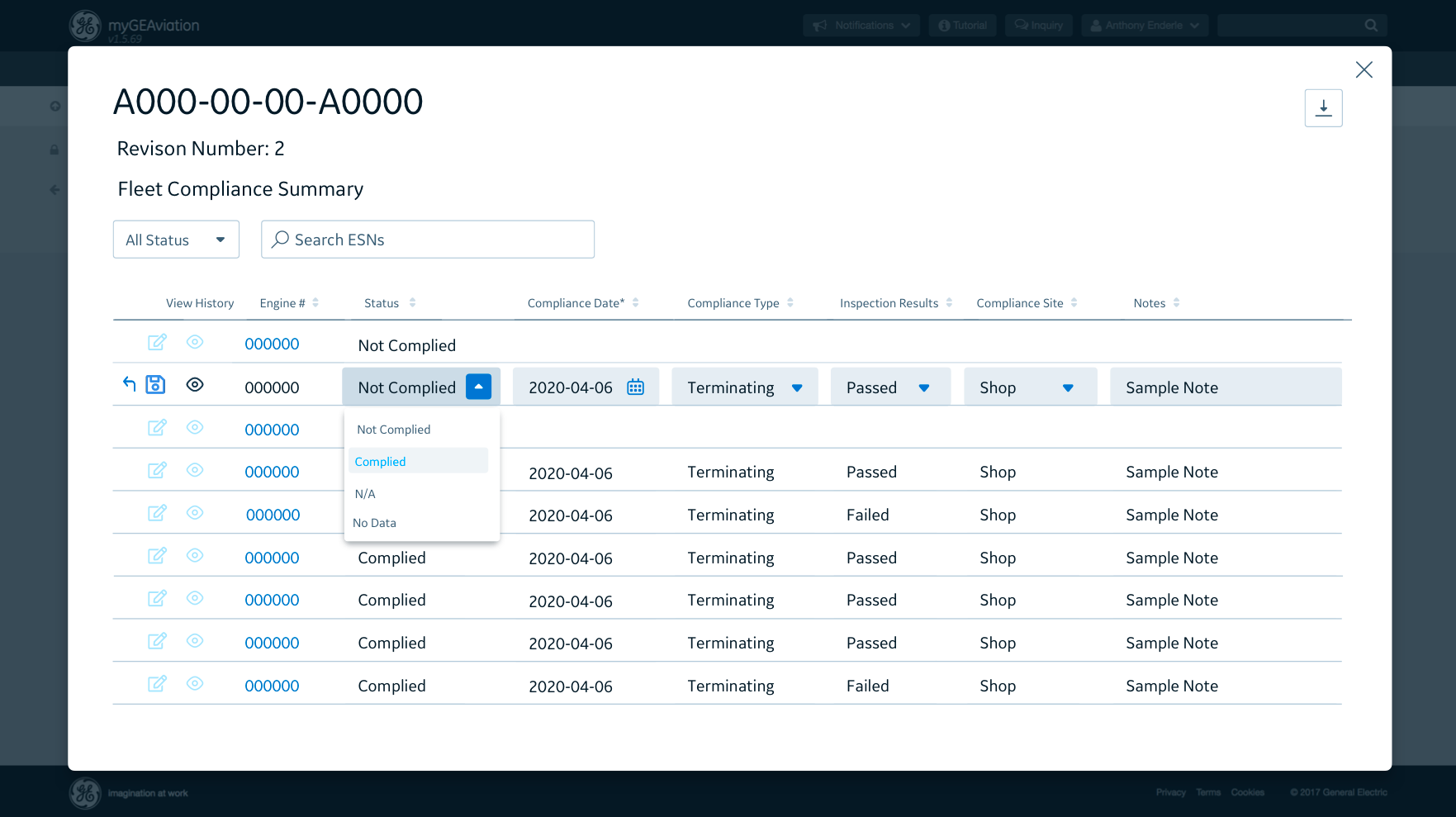
Example of improved design
Completing development team requirements: My development team was based in India. We met at 8am (5:30 for the development team) bi-weekly to discuss sprint planning and address any UX changes/concerns. We had two meetings during this week, one that I lead to go over specific UX requirements and to make sure the development team was properly implementing designs and one lead by the development team to discuss progress.
In these meetings, development would often bring up new requirements or changes that had to be made to fit their limitations or coding concerns. This was happening simultaniously to cleaning screens due to the Agile process.
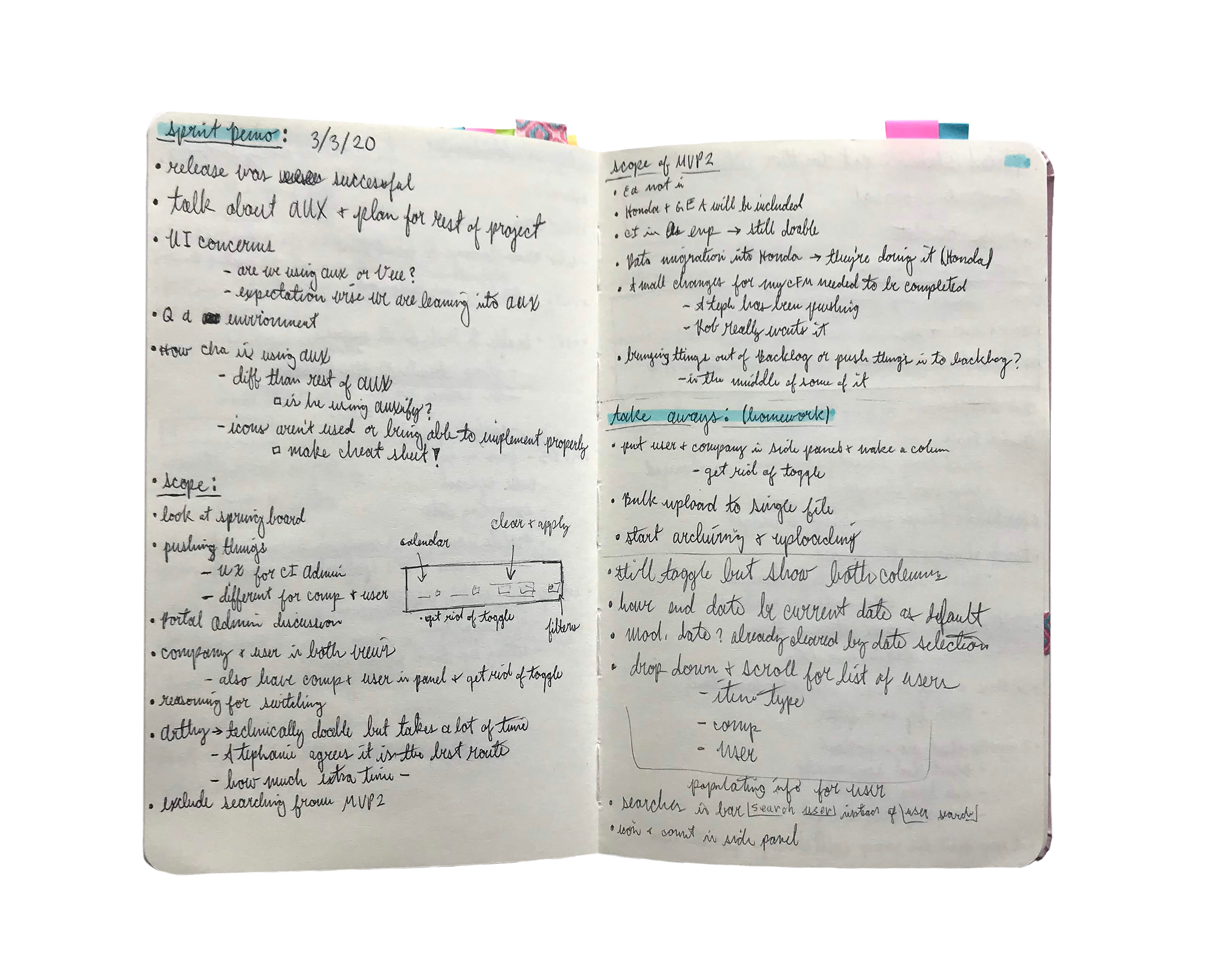
My notes documenting our team meetings and new requirements
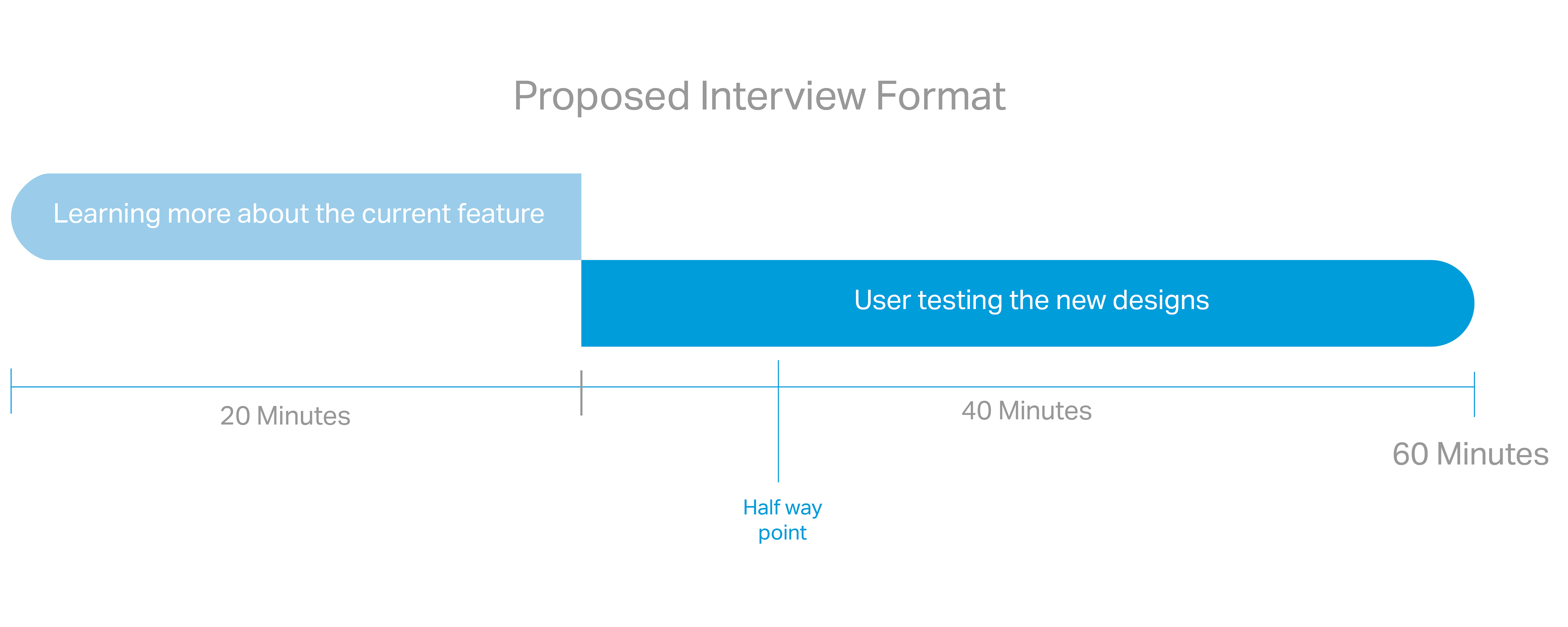
Creating and approving interview format: We broke the interview down into half learning about the current product and half demoing the new designs using InVision. We decided to do this because our position at GE meant we did not have clearance to the old system due to security concerns. This way we could expand our knowledge on what the old system provided and what shortcomings it might have had.
My researcher and I pitched this interview format to our stakeholders to get it approved. We then were given a list of contacts to interview from all over the country.
Conducting the interviews: These interviews were conducted over Skype. I took notes while my researcher walked the user through the interview. We were specifically developing a way for the user to upload information in bulk to our feature. Getting to see how the current system operated was also helpful in arguing for a similar element to our development team.
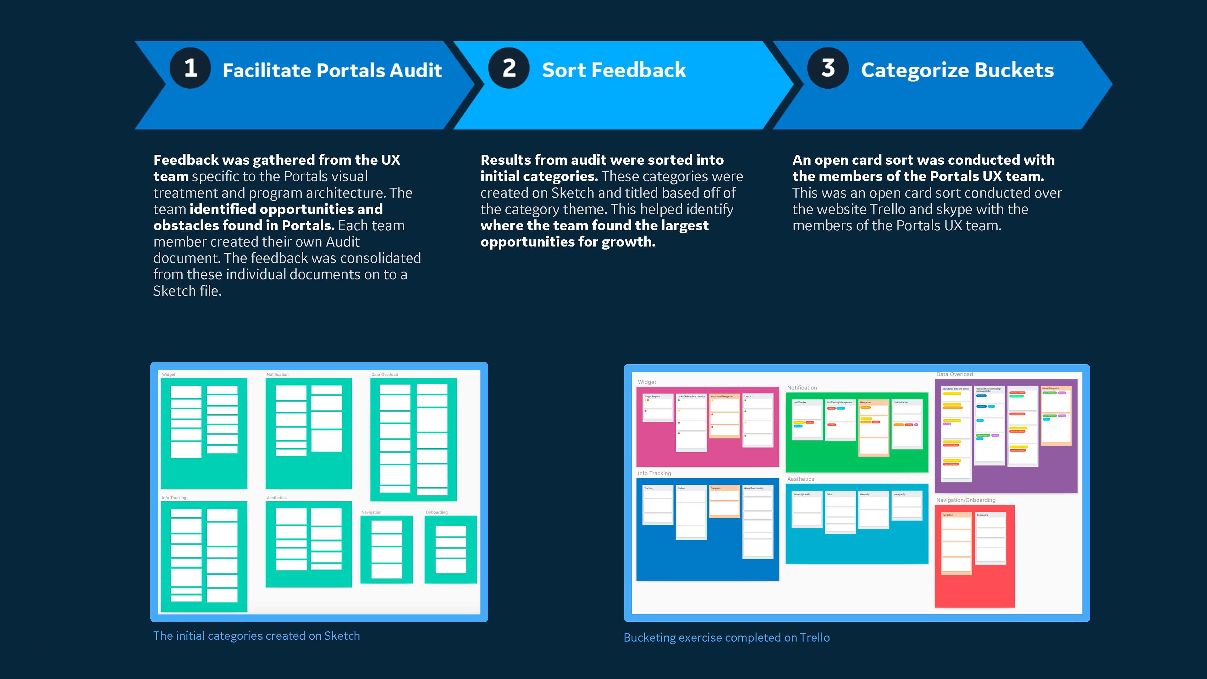
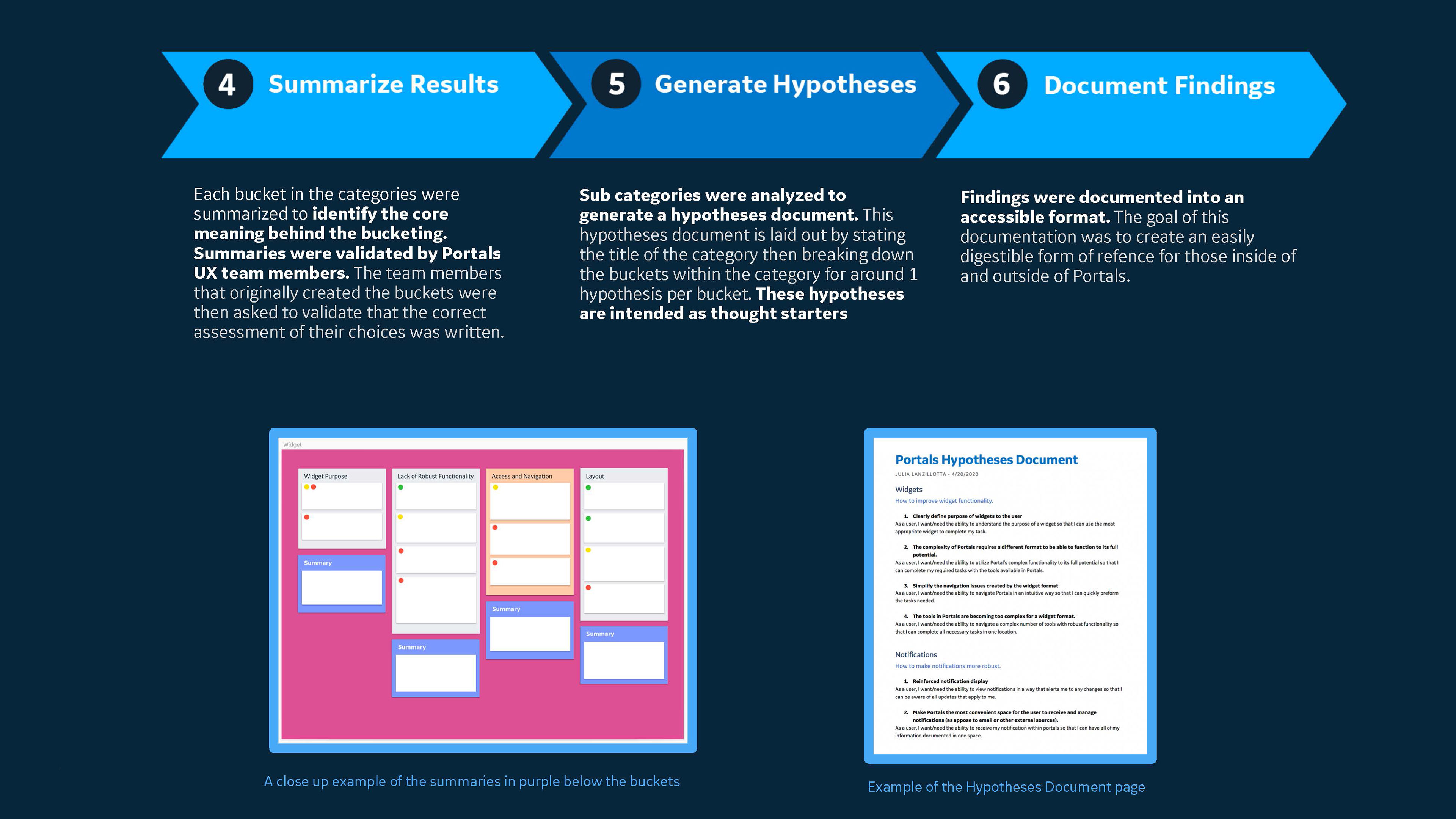
Implementing user testing: With 4 members on the UX team, we participated in a closed card sort using post-it notes. First, we analyzed the notes to pick out lines of feedback and wrote those out on post-it notes. Then we each took turns placing the post-its on a whiteboard under pre-made categories that we later grouped together to find the specific areas of improvement pointed out during the interviews.
I begin the design phase by hand sketching wireframes before implementing digitally. This helps me visualizes and easily edit the concept while making sure it fulfills the points brought up in user testing.

Examples of wireframe sketches based on user testing
Working with standardized components: GE has its own system of components that is constantly being updated and improved. Part of the job of creating a new product was to also expand on the design standards for the system
Working within development limitations: This was my first time working with a development team and adjusting designs to any limitations was a hurtle I was not expecting. Throughout my time on this project, I got in the habit of showing multiple designs in our UX meetings. This way we were able to discuss which was best for the user and also manageable in our time frame and budget.
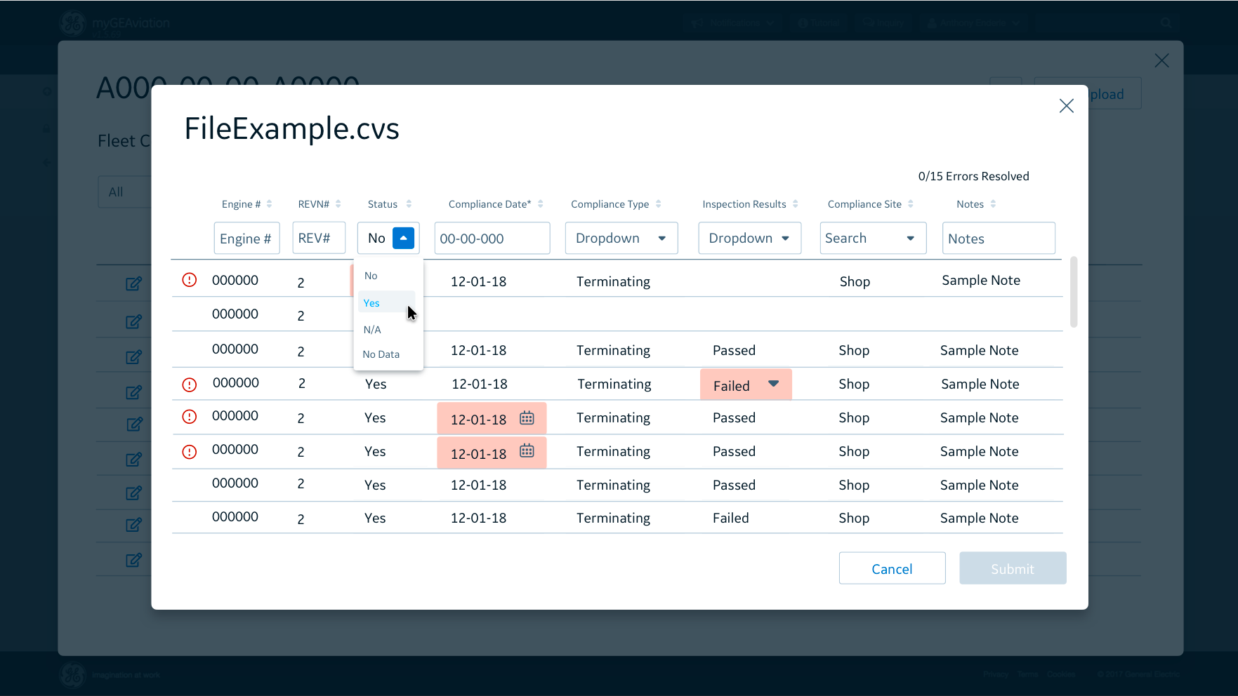
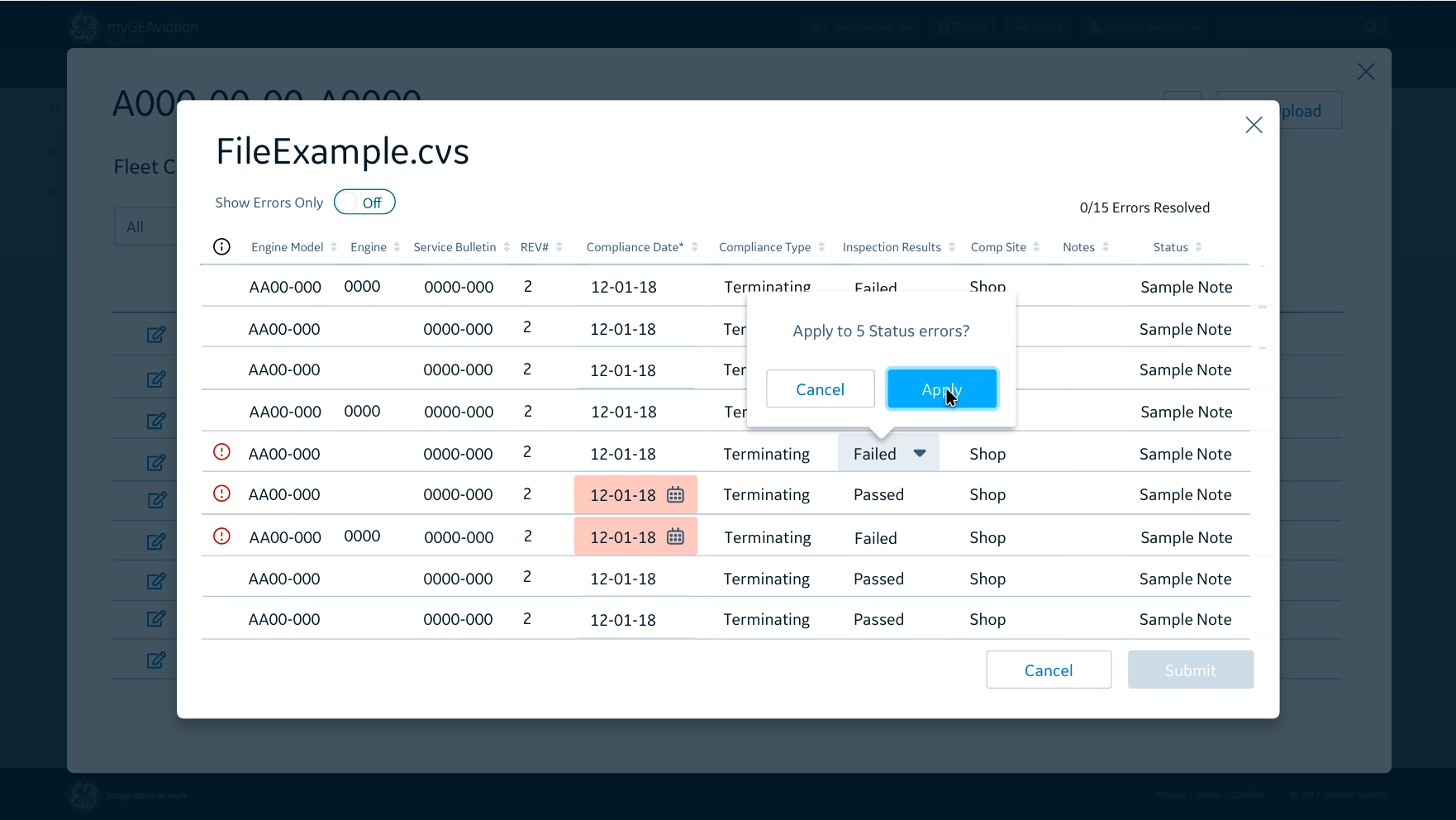
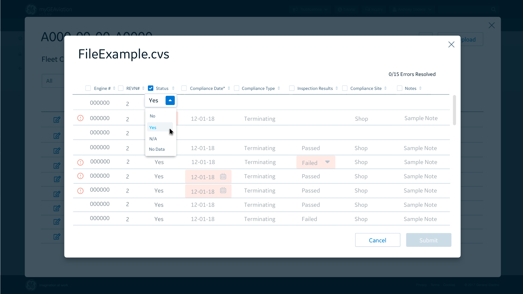
Examples of three different solutions to fixing errors in bulk
Changing requirements: The structure of the development for this product was broken into three phases so my designs had to initially be able to evolve throughout the requirements of each phase. This, paired with challenges that would arise throughout the Agile process, meant I had to be flexible with my designs.
At one point during the process, a seemingly small issue resulted in us having to re-format the entire feature. Below I have an example of the original home screen (left) and the new format including tabs (right) that allows users to check the upload status of their bulk uploaded files.

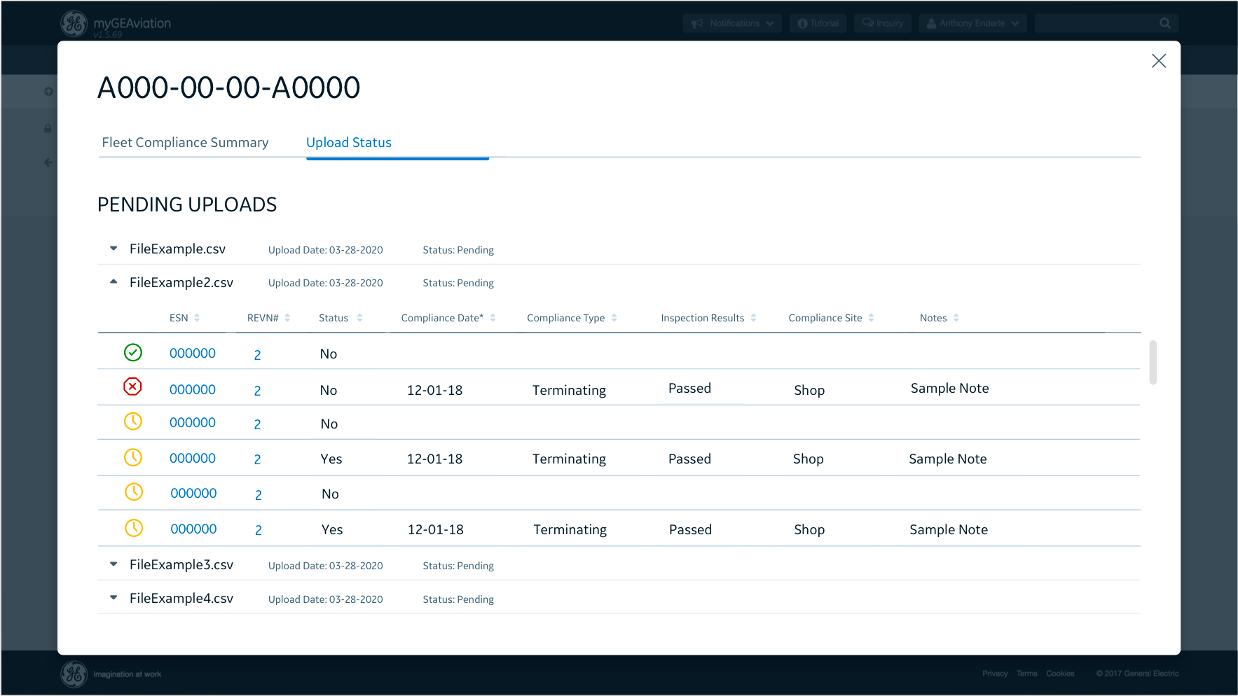
The original format
The tab format
Finalizing the designs: After presenting the designs to the development team and the Portals UX team for final feedback, I pitched the final designs to the project stakeholders including my product owner. Once these designs were approved, we entered the next stage of development while my development team in India continued creating the latest screens.